It’s spring, and with the change of season, ServiceNow graces us with a new version of its platform. San Diego is its name, in tribute to the city that was the birthplace of this success story.
A few months ago we presented the great novelty, a real revolution, that is the Employee Center, with the profound impact it will have on the employee experience.
With San Diego, the editor consolidates its approach, and among the new features, we have chosen to highlight the new functionalities associated with surveys and questionnaires, which are increasingly used by our customers to develop employee engagement and measure satisfaction as well as NPS. Another great new feature, which covers many use cases for HR Service Delivery automation and onboarding process, is the addition of RPA and OCR capabilities to the platform.
But before we start, we would like to keep the conversation rolling with the employee center and the user experience by highlighting the analytics that will give HR and UX designers a clear vision of metrics and interactions to better understand the Service Portal user experience and identify how to improve it.
Since Rome, you had the opportunity to familiarize yourself with the new experience that the Employee Center brings, now is the time to take it a step further and improve it thanks to User Experience Analytics for Service Portal and mobile.
Build on User Experience and Employee Center thanks to User Experience Analytics
User Experience Analytics is available for mobile app, employee center, agent workspace and back office.
ServiceNow has provided template notices that are presented to users depending on their geographic region. Customers should review these notices and confirm they are in accordance with applicable law before they are presented to users. It is possible to tailor the specific options for how these notices are presented to users (including the specific wording)
User Experience Analytics automatically detects the gestures and actions of portal users. You can view each occurrence of these events on the Analytics Dashboard.
Main events are already configured, but you can always create new ones. You can use the analytics to optimize the user experience, and the deflection ratio, for example.
Main events available out of the box:
| EVENT | DESCRIPTION |
| Submit Catalog Request | Tracks when a user submits a request through the SC Catalog Item widget. You can view the request ID and the number of items in each request. |
| Order Catalog Item | Tracks when a user orders a catalog item through the SC Catalog Item widget. You can view the name and ID of each ordered item. You can also view the associated request ID. |
| Submit Record Producer Request | Tracks when a user submits a request through any record producer. |
| View Knowledge Article | Tracks when a user views a knowledge article. You can view the name, ID, and language of each viewed article. |
| Initiate Search | Tracks when a user searches the portal using the Faceted Search and Typeahead Search widgets. You can view the search keywords that users enter. You can also compare the usage of the two search widgets. |
| Search Result Selected | Tracks when a user selects a search result when using the Faceted Search widget. You can view the click rank and sys_id of the selected search item. |
| Successful Login | Tracks when a user logs in to Service Portal. Use these analytics to monitor login activity within a given time period. |
You can have metrics across all applications, and dashboards dedicated to a specific application, like the employee center.
We have selected some reports to give you an idea of the power of this User Experience Analytics module:
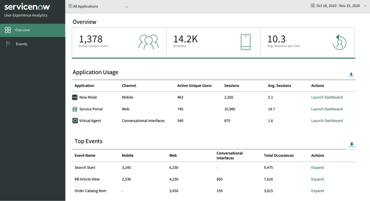
App usage
To give you a view of user adoption, see analytics such as the total number of users of your site or app, the average number of sessions opened daily, and how long sessions last on average.
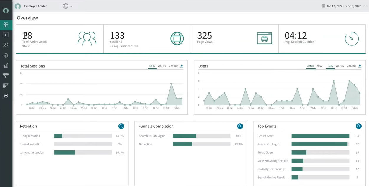
Screens module and Pages
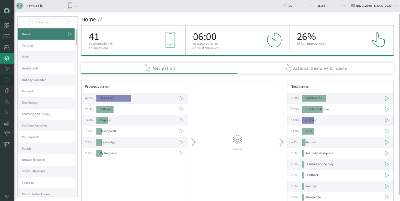
The Screens module and Pages module show analytics specific to pages on your site or screens in your mobile application. You can view user action and navigation details for each.
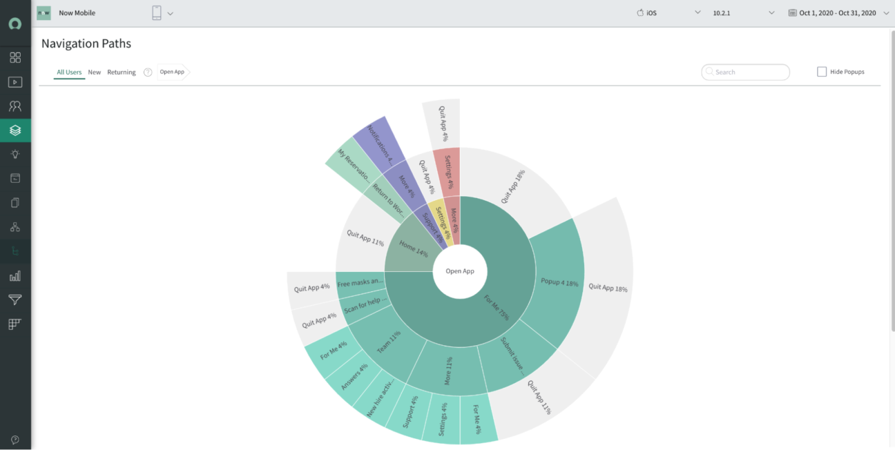
Navigation path
Navigation paths enable you to quickly understand and isolate users’ journeys through your web or mobile application. They give you insights into the paths users follow from a root screen. These can help you:
- identify user journeys that show user confusion, for example, navigation back and forth between two screens
- identify critical journeys that end prematurely
- understand the effect of pop-ups on user navigation
You can interact, each circle on the visualization represents a navigation level, and shows the number of navigations from the previous screen, up to five levels.
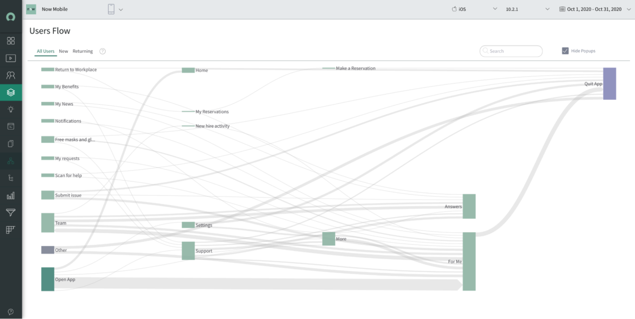
User flow
A users flow can help you quickly understand where most of your users journey between different screens. A flow shows the inbound and outbound journeys for each screen and pop-up within your app. With user flow insights, you’re able to:
- investigate problematic screens to understand screen usability or performance issues
- understand user intent, for example, the different trends between new users who search around the app much more than returning users
- routinely monitor navigation patterns
- discover behavior trends across factors such as devices, user demographics, and operating systems
User Retention
User retention reports can help you understand if your app meets your users’ needs and expectations, and enables you to measure how your app optimization efforts impact user retention.
New content publishing capabilities in Employee Center
As part of the San Diego Release, the author will be able to use new content library types for the portal, such as events, rich-text, and image-based links. Admins can add videos as a new styled content type. It includes an embedded video player that is fully responsive to adjust for various desktops and mobile views.
Yet the most important new feature is the ability for the author to preview their content in a full portal view while authoring this content.
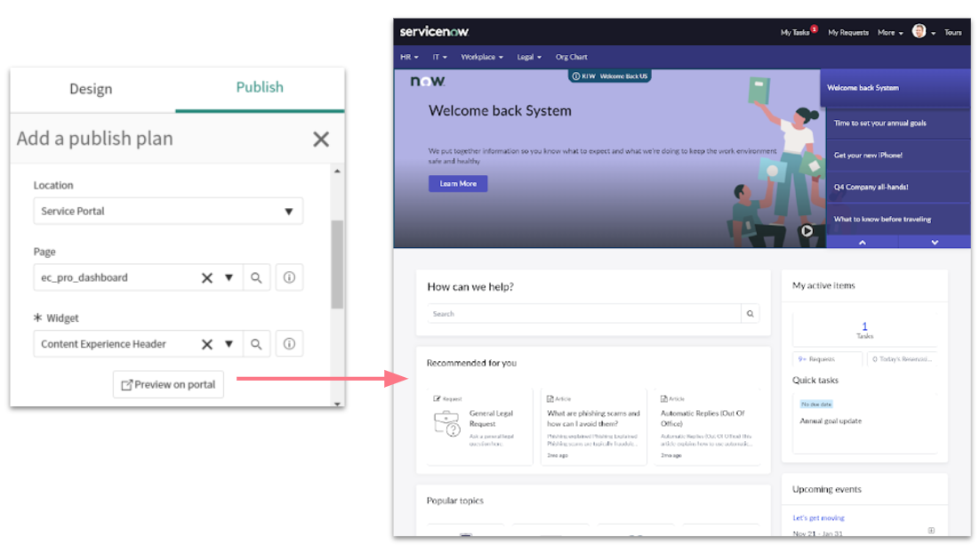
Another important feature of the Employee Experience and the Employee Center is the ability to differentiate topic pages in their design. Starting with San Diego, you can specify an alternate page layout for topics e.g., to show an additional content type. It also gives you the ability to apply the alternate layout selectively within the topic hierarchies.
New unified employee profile page
With San Diego, you can aggregate employee information across departments and systems on one single employee profile page.
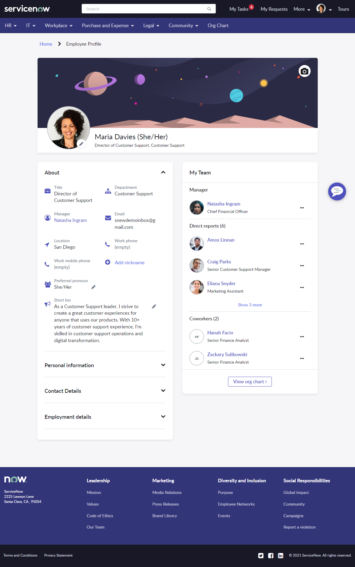
You can leverage the Employee Profile for AI Search and make ML-based content recommendations on the Employee Center.
What’s new with the survey?
The survey is a platform feature, available for all applications.
First a quick comparison between new and legacy features for the survey:
| Capability | Surveys | Legacy Surveys |
|---|---|---|
| Surveys in Service Portal | ||
| Save new survey responses each time a user takes the same survey | ||
| Create question templates to reuse sets of answer options | ||
| Categorize survey questions and report on category results | ||
| Deactivate a survey without deleting it | ||
| Create conditional questions | ||
| Send surveys automatically based on a schedule | ||
| Customize survey questionnaire color scheme | ||
| View survey responses on graphical scorecards | ||
| Save surveys in a draft state until they are ready to publish | ||
| Create and send surveys from one page | ||
| Allow only specific users to access a survey | ||
| Send surveys based on conditions | ||
| Send survey email notifications | ||
| Limit how often a user can take the same survey | ||
| Add introduction and endnote text | ||
| Create survey modules | ||
| Public survey: Allow persons to take a survey without logging in | ||
| Use update sets to track changes |
Why this feature is key and underestimated?
Taking the pulse of your collaborators, and being able to engage them beyond a satisfaction survey after their case resolution is one of the components of a great employer brand. So it’s key to the ability to retain talents.
With ServiceNow, you have the opportunity to create assessments, surveys, and quizzes. As it is a platform functionality, it is an opportunity to create a seamless approach in a simple way across the different departments that offer their service on the portal, in one word, to put the employee need and feedback at the center!
One quick survey
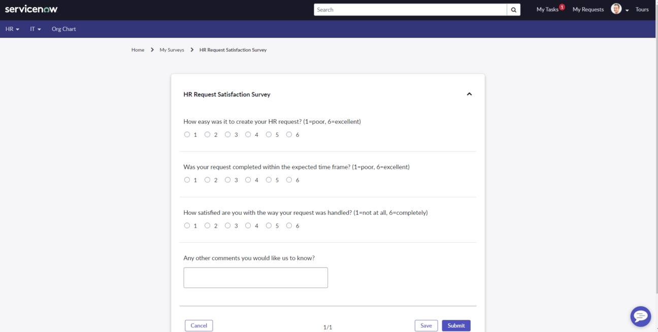
A One Click survey has no introduction page in Service Portal. This survey doesn’t have the Submit and Cancel buttons in the desktop and mobile device view.
Note:
- The One Click Survey field should be selected in the survey definition
- If public access is enabled for a One Click survey, a user can submit the survey without having to log in
- If public access is enabled for a survey, you can’t configure a signature or an attachment for the survey
- For a published public survey, the Signature field is hidden and you can’t add an attachment
How to enable the One Click survey?
You need to update the system property glide.sg.universal_links.enabled to true

Then enable the One Click survey on the survey of your choice:
First, set the pagination to None

Then enable One click survey

With these settings, you will be able to create a new and easy experience for the employee, as they will receive a link via email or SMS or the new portal widget that will bring them directly to the survey.
On the Employee Center, you will notice a new widget showing the survey.
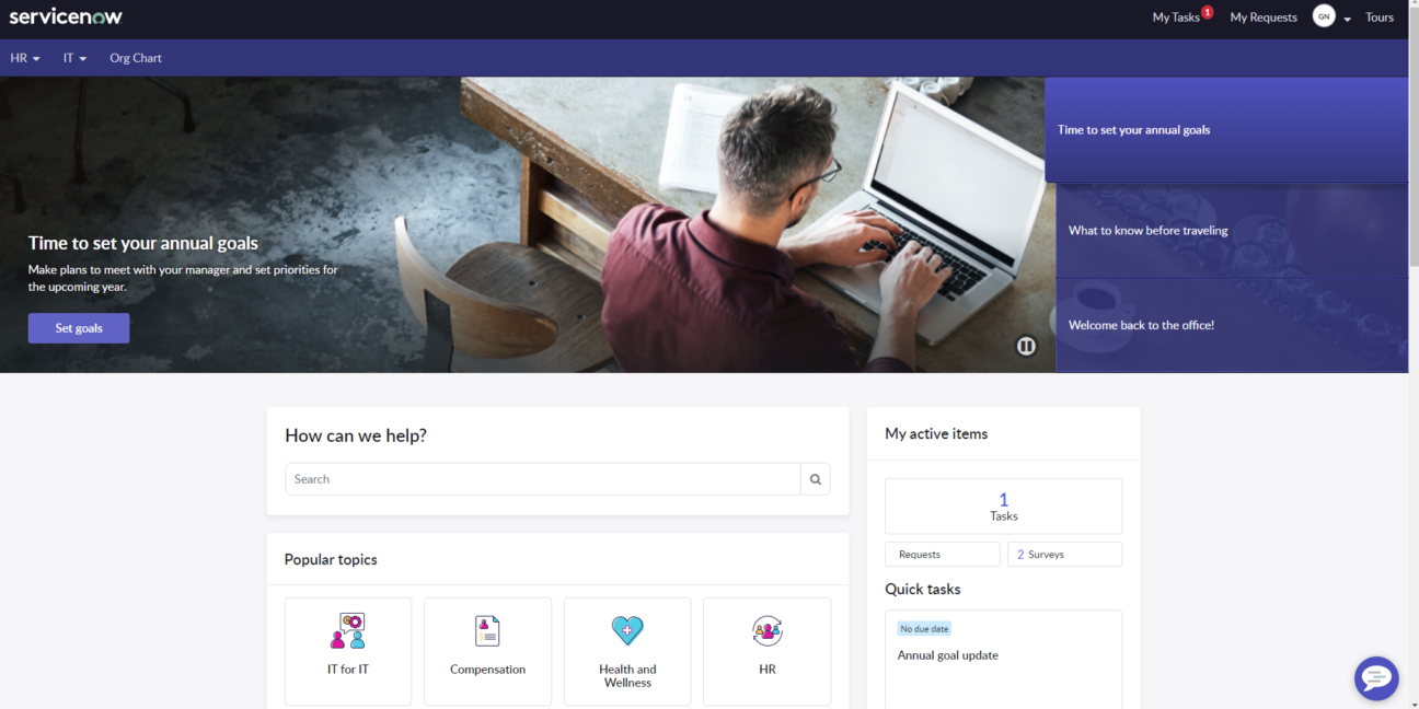
When you click on the Survey tile, you will access your Assessment and Survey page.
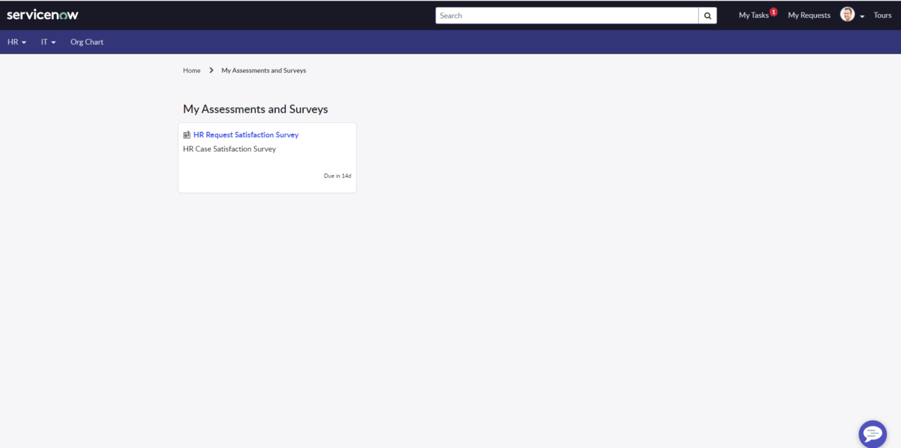
Click on the survey and you will directly access it.
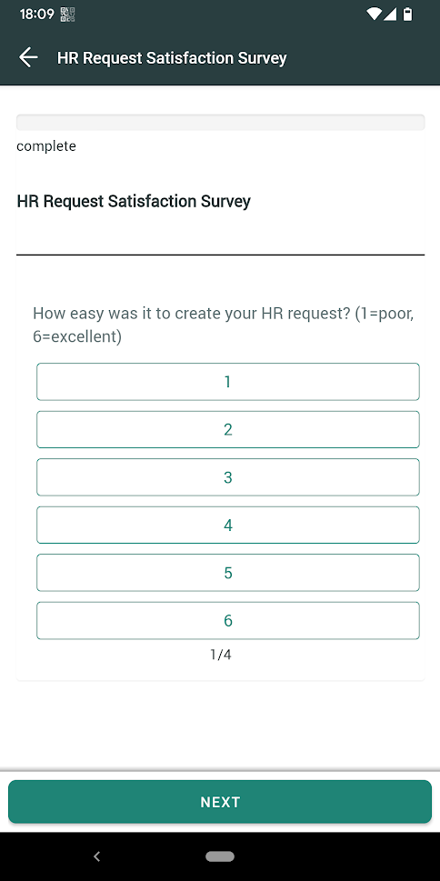
It’s also available in the mobile app
The collaborator will receive a notification.
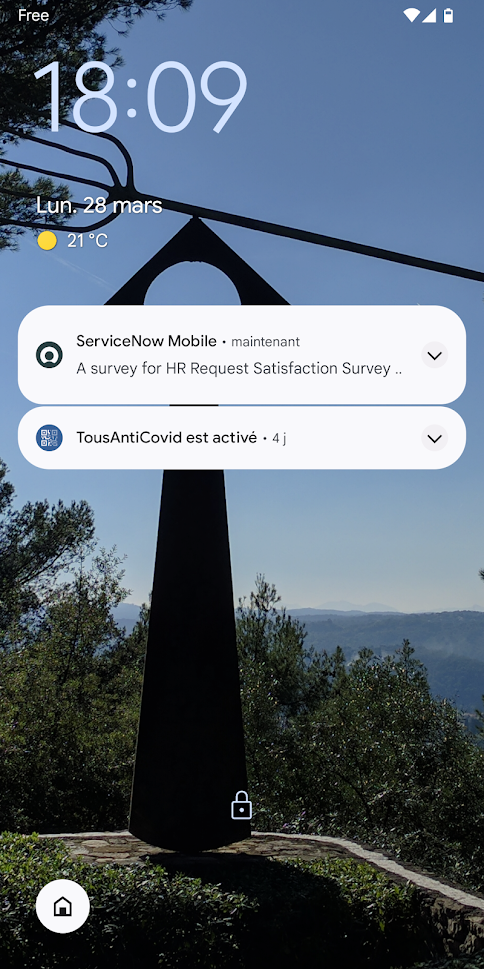
With a click, the survey will be directly accessible in the mobile app.
New platform UI and Workspace updates
There is one more feature that is not reserved specifically for HR or Employee Workflows and that feature is one of the biggest changes ServiceNow brought with its San Diego release – a new UI called Polaris.
Unlike the previous UI update from UI 15 to UI 16, the Polaris UI update is a platform-wide enhancement. Therefore we recommend exploring the feature with your stakeholders and backend users and determining whether this update brings the key benefits in terms of navigation you look for.
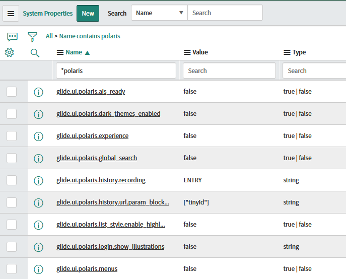
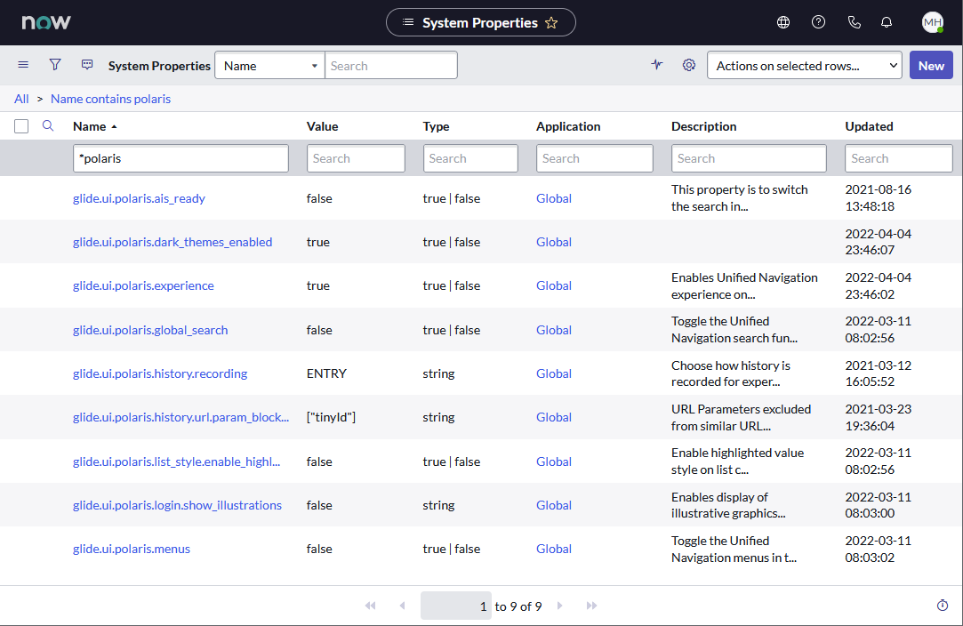
You can activate the Polaris UI in the System properties – set the value from “false” to “true”:
And then, voilà…
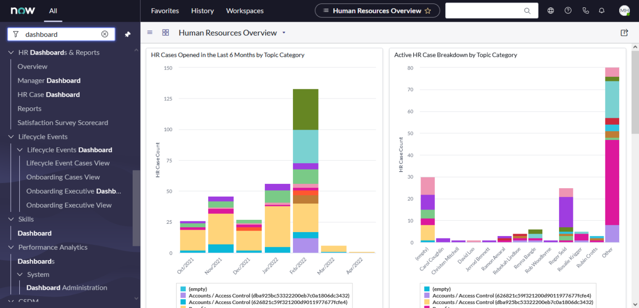
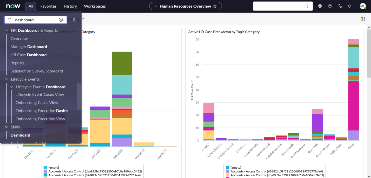
One of the biggest changes compared to the old UI (apart from the visuals) is the option to pin (or unpin) the left menu panel.
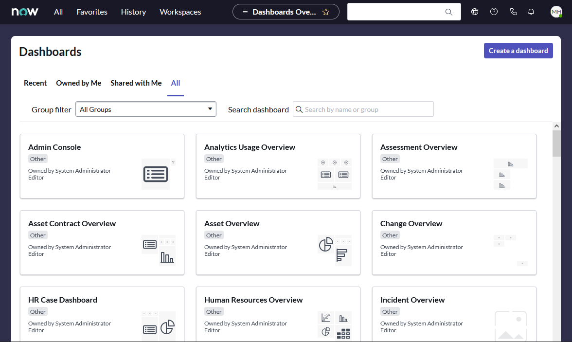
List view
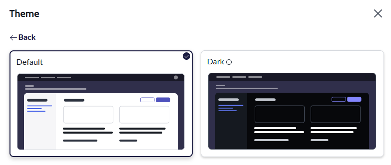
Next on the menu is the San Diego update for the Workspace. The most notable enhancement is the Dark theme which you can set in the Preferences under the User settings top right.
RPA and OCR capabilities
Last but not least, let’s talk about the new RPA and OCR capabilities of the ServiceNow Platform thanks to the San Diego release.
A year ago, the company announced the acquisition of Intellibot, an RPA startup.
12 months later, the capabilities are fully integrated into the Platform, and it opens new opportunities for process automation, especially when you couple the RPA and the OCR, which is also a new feature available in the RPA design studio.
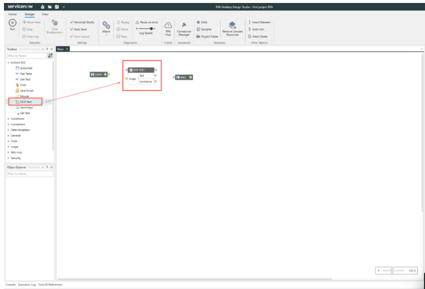
For now, you can Extract text from an image by using the ActionSet OCR Read Text component in RPA Desktop Design Studio.
Don’t hesitate to contact us to receive the most actual information regarding ServiceNow and its products. Feel free to reach out in case you are interested in a demo or professional services.
